What Colors To Wear For Family Photos

What Colors To Wear For Family Photos | Examples & Tips
Trying to figure out what colors to wear for family photos is one of the most stressful parts of planning a family photoshoot. I know when I am capturing the essence of a family in a photograph that those photos become priceless and a form of artwork. Every hue and shade contributes to the narrative of togetherness. As families prepare to freeze the moment in time, the question of what colors to wear becomes pivotal in shaping the visual story.
One of the biggest challenges when planning portraits for moms is deciding on what to wear. I am here to help you on this journey and to take the stress out of finding the best family photoshoot outfit ideas.
I can tell you from over 20 years of photographing families in California that what families wear plays a huge role in the outcome of their portraits. With that being said, I have put together this comprehensive guide on Choosing and Coordinating Colors for Family Photos.
From understanding the basics of color theory to practical tips on achieving the perfect balance, join us as we navigate the world of hues and tones to ensure your family portraits are not just pictures but timeless reflections of the love and connection you share.
If this sounds a bit overwhelming, please continue to scroll through the blog as we offer examples of color schemes and ways to choose the best colors to wear for your entire family.
Learn about Christopher Todd Studios' family portrait photography.
1. Stick With Neutral Colors
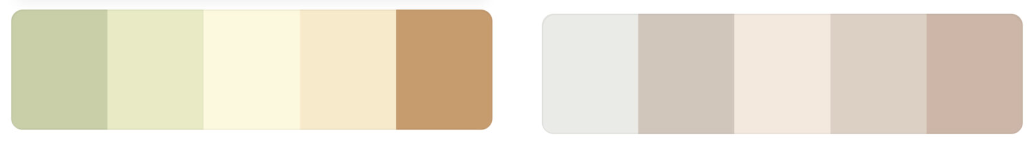
Another name for neutrals is earth tones. Think of them as toned-down softer colors that feel more relaxed. Neutral colors are much better to pair together than bright saturated colors and will make Mom's job of coordinating outfits much easier

2. Use A Color Palette Or Color Scheme
This can help to create a cohesive and visually pleasing look. Choose a few key colors and incorporate them into each family member's outfit.
A simple way to think about color schemes is to break all colors into two categories. Warm or Cool. Keep all of your outfits either warm-toned (yellows, browns, oranges) or cool-toned (blues, purples, greens). Read on to learn more in-depth about color schemes.
PRO TIP: Think About Seasonal Colors:
Consider the season when planning your color scheme. For Fall, warmer tones like reds, oranges, and browns work well. While in Spring, cooler colors like pastels and light blues may be more suitable. Seasonal colors can enhance the overall mood and atmosphere of your photos.

3. Choose Colors That Complement Skin Tones
It's essential to choose colors that flatter each family member's unique skin tone. Warm tones like reds, yellows, and oranges work well for those with Olive skin tones, while cool tones like blues, greens, and purples are better suited for those with pale fairer skin tones.
Some shades may complement or enhance different complexions, while others may clash. Oftentimes I like to recommend clothing colors that enhance eye color. A good example of this is a blue shirt for anyone with blue eyes. However, don't forget to consider individual preferences.

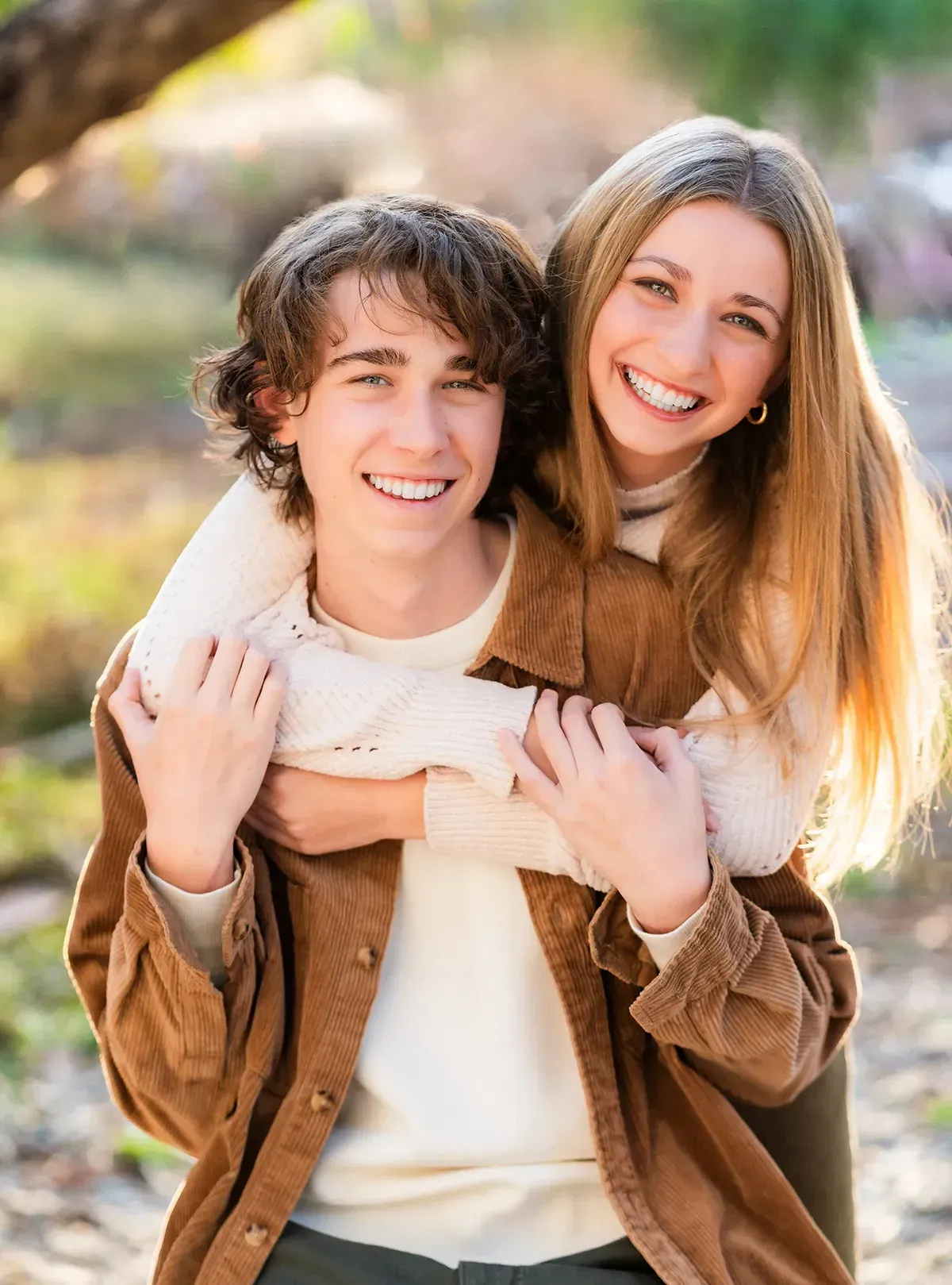
4. Avoid Matching Outfits
GONE ARE THE DAYS OF BLUE JEANS AND MATCHING WHITE SHIRTS.
While coordinating colors is important. However, don't make the mistake I've seen most often by having everyone wear the exact same outfit.

Instead, aim for a mix of monochromatic or analogous colors in the warm or cool-toned palette.
Reasons not to wear matching tops, or have everyone wearing the same color
- Individuals blend into each other and don't stand out
- Personalities get lost in the photo
- The photo becomes dull and unappealing
Balance Bold and Neutral:
- If you have a bold or dominant color in your scheme, balance it with neutral tones like white, beige, or gray.
5. Use Patterns Sparingly
My rule of thumb is to wear 2 solid-toned outfits for every pattern outfit. Some other great strategies for coordinating patterns and solids.

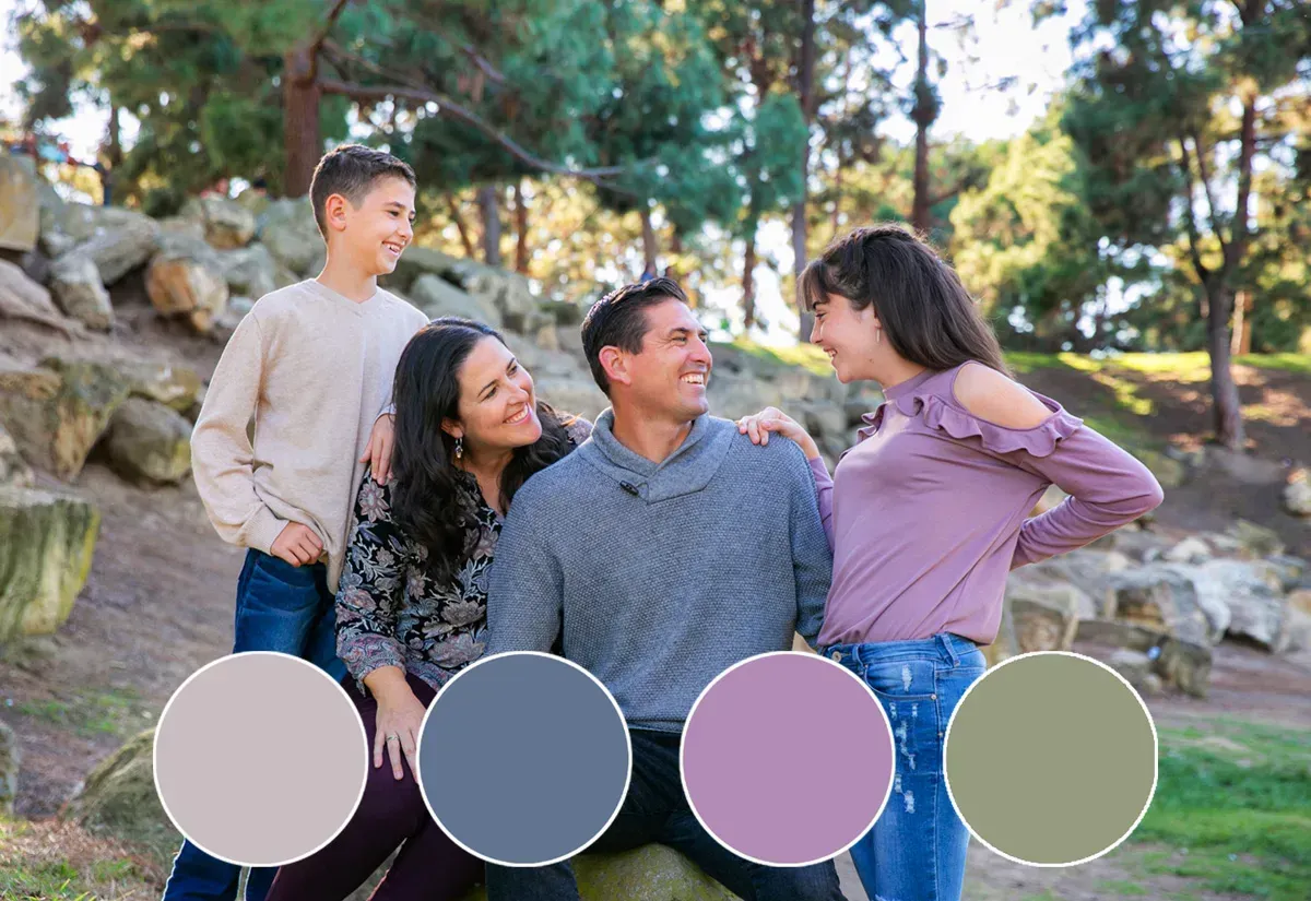
Coordinate, Don't Match
I love how in this photo the dad is wearing a white shirt so he stands out and the mom has opposite stripes. The earthy tones and flowy dresses they chose work perfectly for this photo.
Pro Tip: Mindful Pattern Use:
- Incorporating patterns can add depth and texture to your photos, but be mindful of their scale. Mix smaller patterns with larger ones and solid colors to avoid a busy or chaotic appearance.

BONUS Personal Style
It's important to let each family member's personal style shine through in their outfit choices. This will ensure that everyone feels comfortable and confident in their clothing.
Pro Tip: Once you have chosen a color scheme and a palette, start with Mom's outfit first, which could be the base outfit. I suggest starting with Mom's outfit first because once Mom loves what she is wearing, the rest of the family with build on that and fall into place.
Consider the Location:
- Take into account the setting where the photos will be taken. The colors of the background, such as the natural landscape or the walls of a studio, should complement the chosen color scheme for your outfits.
How do I use a color wheel to plan family outfits?
I've always found color to be fascinating. As an artist, I have been using a color wheel for many years. Whether it be for painting as a hobby or deciding on where to place a family based on what colors they have chosen with the background of our photoshoot. It comes naturally for me to see how colors work together in portrait photography. Understanding a color wheel can be very beneficial to those planning outfits for family portraits.
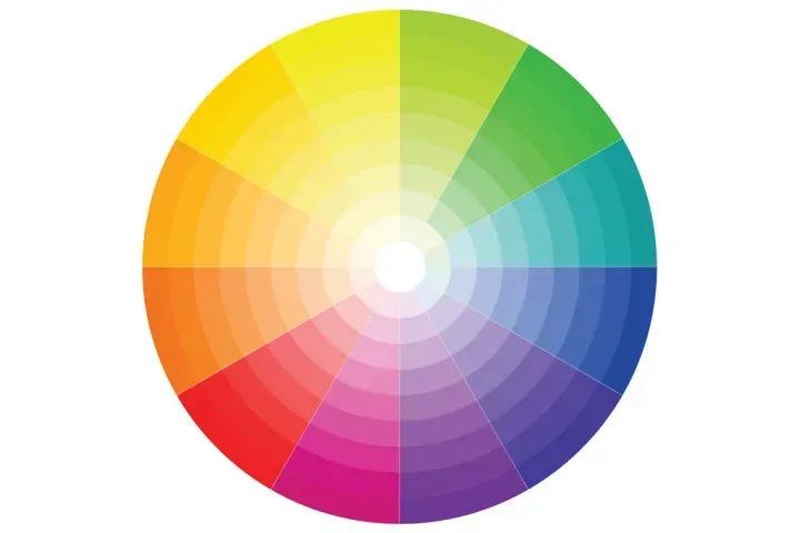
A Simple Explanation Of A Color Wheel
- It is a circular diagram of colors arranged by their chromatic relationship.
- It is a visual tool that helps artists, designers, and anyone working with colors understand how different hues relate to one another.
- The color wheel is based on color theory, which explores the relationships between colors and the visual effects of these relationships.
Understanding The Color Wheel
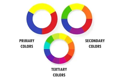
When it comes to choosing the right colors for family outfits, it's important to understand the basics of the color wheel. The color wheel consists of:
- Primary Colors: The three primary colors—red, blue, and yellow—are positioned equidistant from each other on the color wheel. These colors are considered fundamental because they cannot be created by mixing other colors.
- Secondary Colors: Secondary colors are created by mixing equal parts of two primary colors. They are orange (red + yellow), green (yellow + blue), and purple (blue + red).
- Tertiary Colors: Tertiary colors are the result of mixing a primary color with a secondary color. These colors include shades like red-orange, yellow-green, blue-purple, etc.
Color relationships on the color wheel
To pick out harmonious colors for family outfits, start by using the different color relationships on the color wheel.
- Analogous colors are next to each other on the wheel and create a cohesive look.
- Complementary colors are opposite each other on the wheel and provide a bold contrast.
- Triadic colors are evenly spaced around the wheel and offer a balanced look.
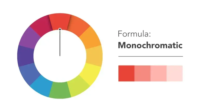
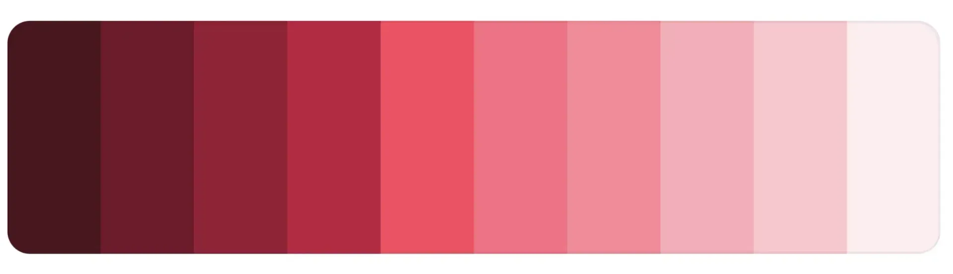
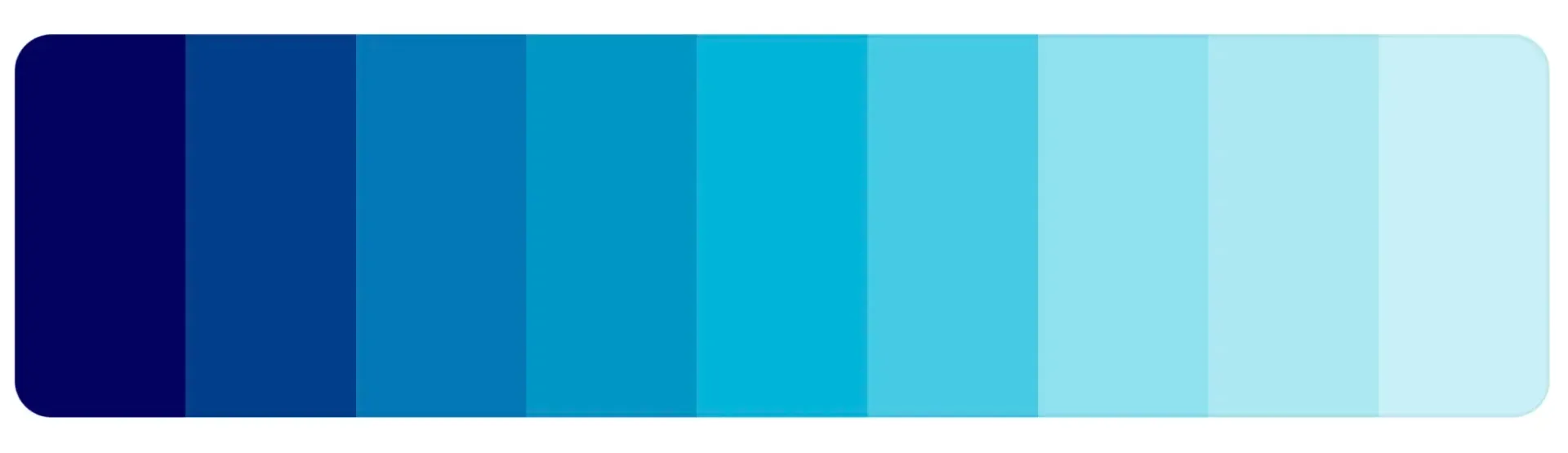
Monochromatic
The easiest formula for cohesiveness when planning what color to wear for outfits is monochromatic. This is because it only uses one color on the wheel. The colors suit each other perfectly because they're all from the same family.Sticking with different shades of a single color for a timeless and polished look.
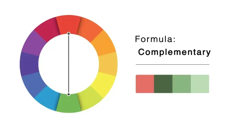
Complementary
Pair opposite colors on the color wheel, such as blue and orange, for a bold and eye-catching look.
- Complementary colors are positioned opposite each other on the color wheel. Examples include red and green, blue and orange, yellow and purple. Using complementary colors in design or art can create a vibrant and visually striking effect.
- A good way to incorporate a complementary color scheme would be to choose colors that complement the background of your photos. For example, if you decide on a park and the leaves are turning yellowish orange look at a color wheel and see what complements those colors.
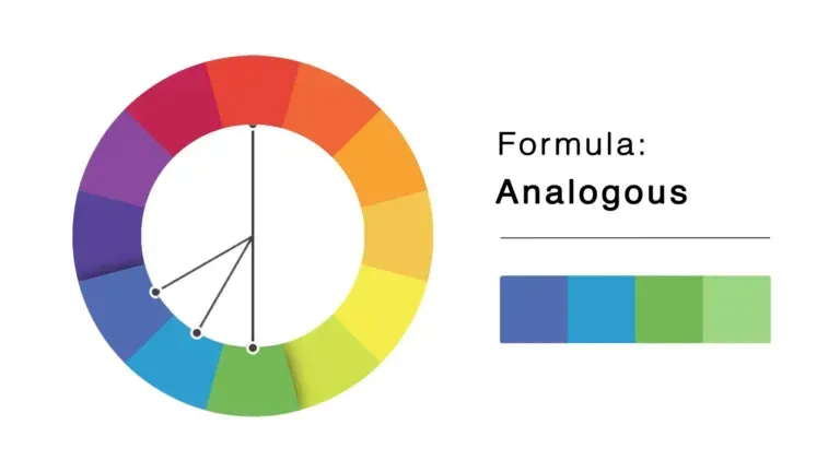
Analogous
This involves colors that are next to each other on the color wheel. They usually match well and create serene and comfortable designs.
- Using an analogous color scheme will harmonize the colors you choose.
- It creates a smoothing look in which one color dominates, one color supports, and the other color accents.
- This is especially useful when photographing families between 3-4 members.
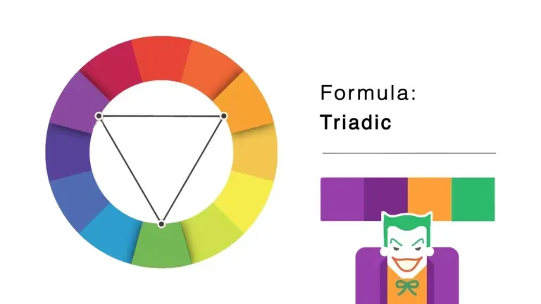
Triadic
Triadic color schemes involve three colors that are evenly spaced around the color wheel. This creates a balanced and harmonious look.
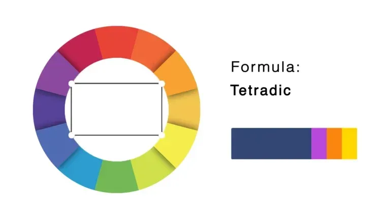
Tetradic
Square color schemes, also known as tetradic, use four colors evenly spaced around the color wheel. This scheme is similar to the triadic, but it offers more color variety but requires careful balancing.
Understand Color Relationships
When putting together family outfits, it's important to consider the color relationships, and how each color will work together. Consider the overall look and feel you want to achieve and choose colors that work together whether it be a monochromatic, complementary, analagous, or tetradic relationship. By understanding the color wheel and using it to pick out harmonious colors, you can create stylish and coordinated family outfits for any occasion.
What is a color scheme?
A color scheme is a grouping or selection of colors used in a design, outfit, artwork, or any visual composition.
- It serves as a guideline for organizing and arranging colors to create a visually appealing and harmonious result.
- Color schemes are based on color theory, which explores the relationships between colors and their psychological effects also known as color relationships.
How To Use A Color Scheme For Family Photos
When it comes to choosing the right colors for family outfits in photos, it's important to consider the overall color scheme. One way to do this is by using a color palette as a starting point. A color palette is a collection of colors that work well together and can be used to guide your outfit choices.
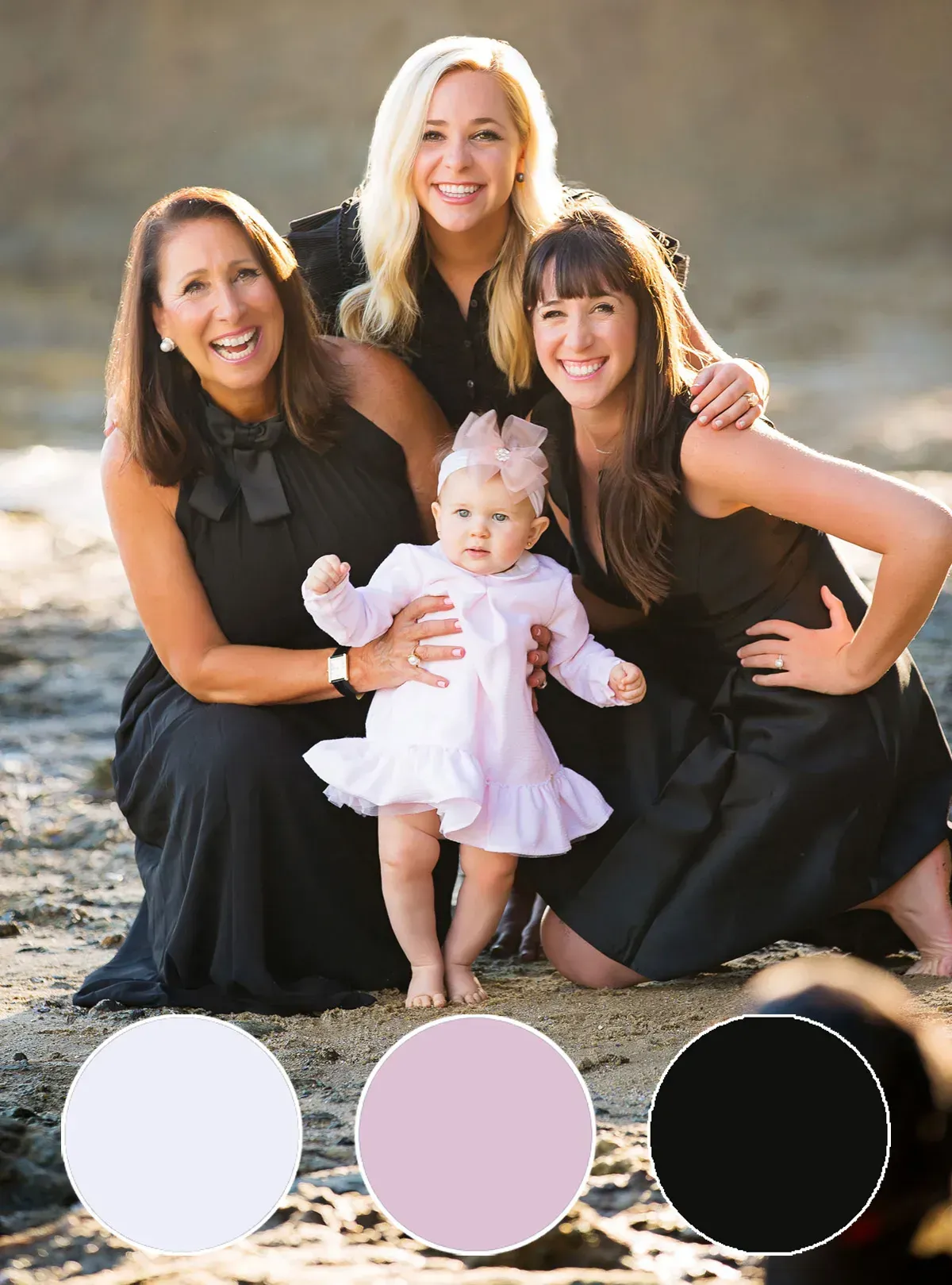
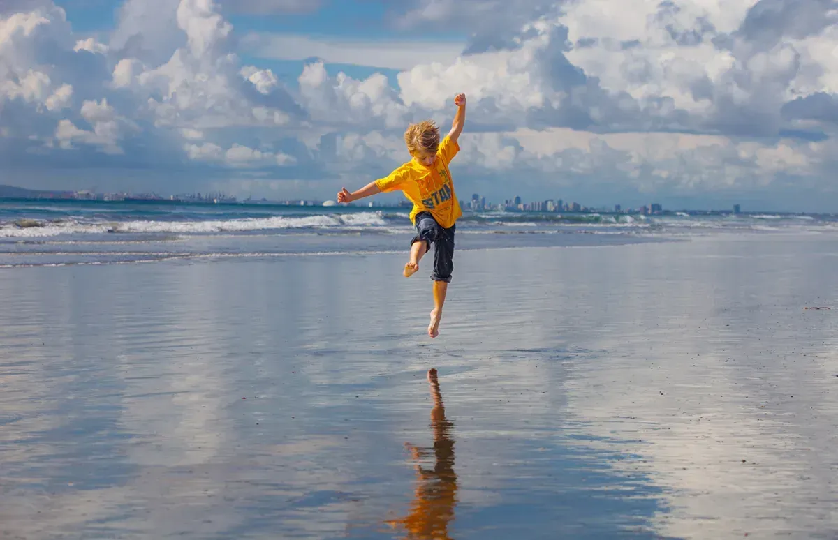
A common starting point for choosing a color scheme for family photos is to take inspiration from the location or backdrop. For example, if you're taking photos at the beach, you might choose colors that are reminiscent of the ocean, such as blues, greens, or warmer tones from the sun and sand.
Beach Color Scheme Example

Another important consideration is the size of your family. Larger families may need to incorporate additional neutrals or fewer colors to avoid overwhelming the photo.

When choosing colors for family outfits, it's important to consider what to wear and what not to wear. It's generally best to avoid wearing all the same color, as this can look too matchy-matchy. Instead, opt for coordinating colors that complement each other.

In summary, when choosing the right colors for family outfits in photos, using a color palette as a starting point and considering the inspiration and size of your family are key elements to creating a cohesive and visually appealing color scheme.
The best way to get great family portraits is to use a color scheme for your photos. Learning how to use a color wheel will help you plan outfits and get ideas for family photos.
Pro Tip: Christopher's Favs
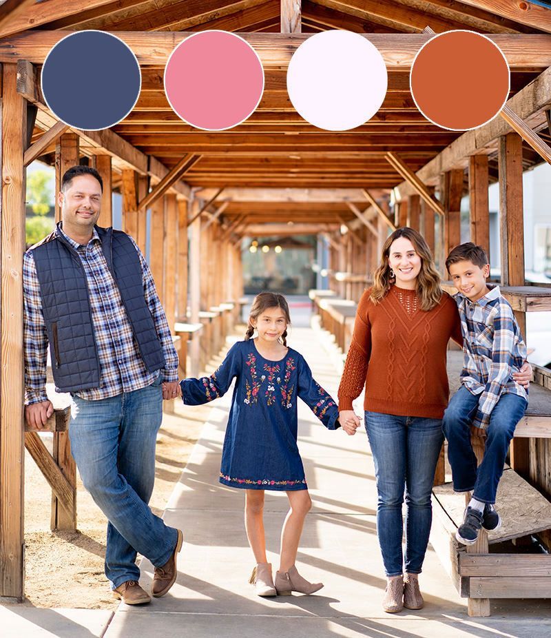
For family photoshoots, I like to start with a monochromatic color scheme.
- Just pick a base color and use different shades.
- Next, add in a pop of color that is complementary.
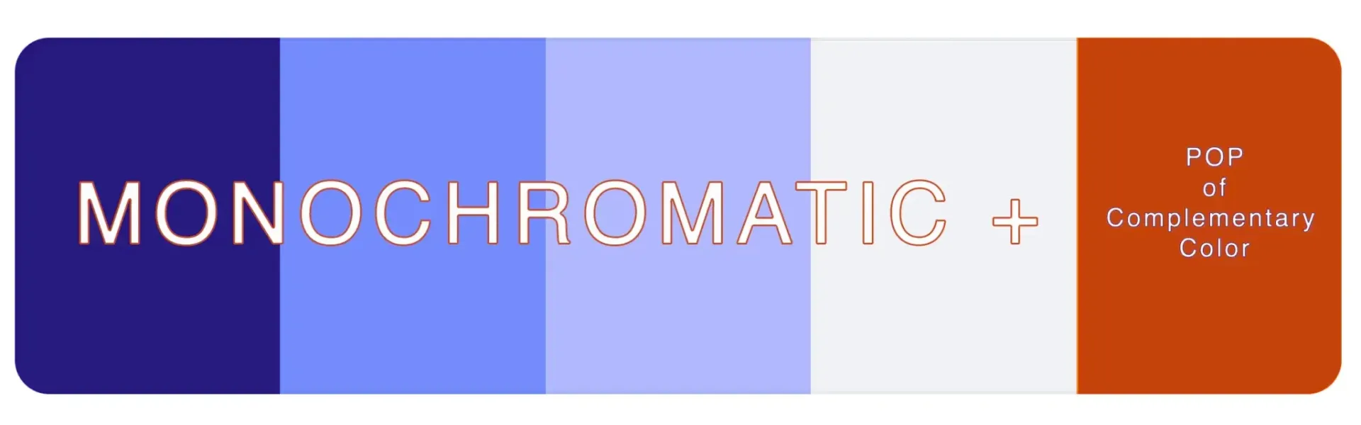
My Color Wheel Cheatsheet
This will help moms harmonize and coordinate family outfits. It is a perfect tool to use to understand color relationships, create harmonious color schemes, and make informed decisions about color combinations that work. It's widely used in various creative fields, including painting, graphic design, interior design, and photography. I have also found a color wheel to be very beneficial for color coordination for family pictures.
Remember to choose muted versions of these colors also known as hues. For example red is a primary color and coral or pink is a hue or muted version of red. Look for shades and tones of the chosen colors to create a more subtle and elegant effect.
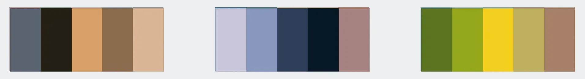
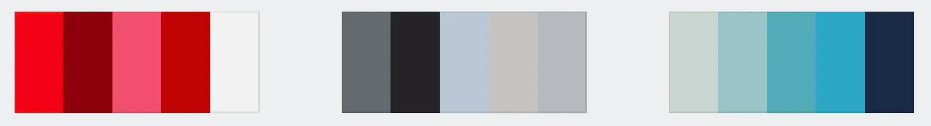
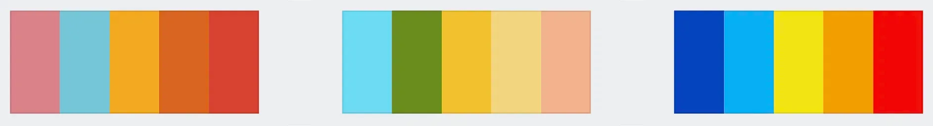
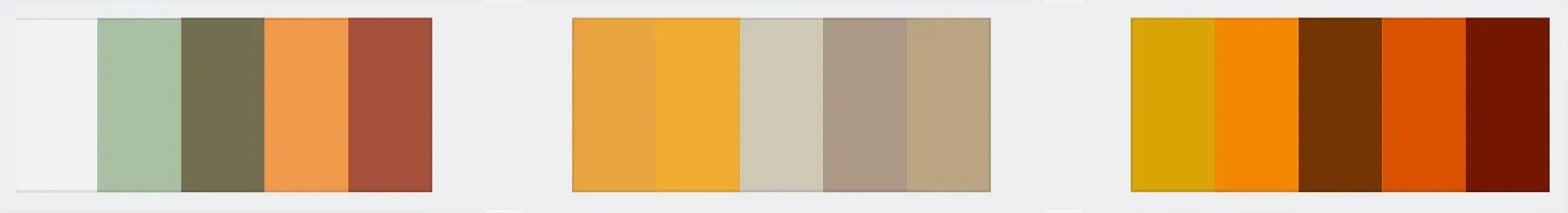
Most Common Color Scheme Ideas
There are several types of common color schemes, each with its unique characteristics. Here are some of my favorites to give you planning ideas.
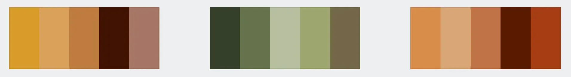
Earthtones
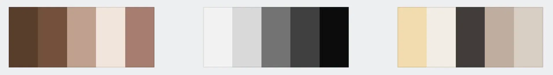
Neutrals
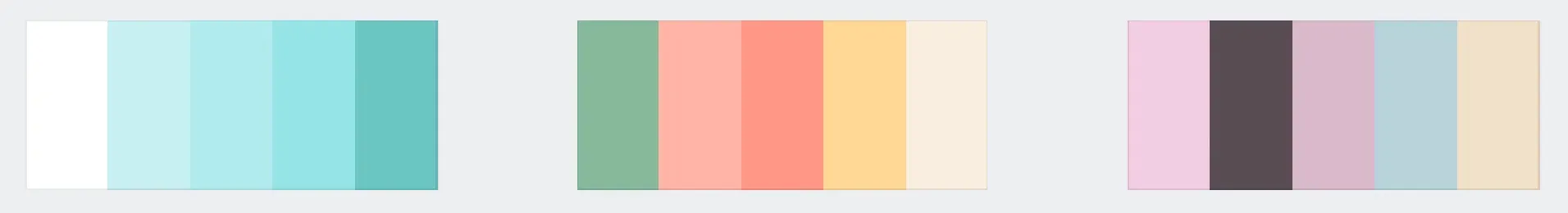
Pastels
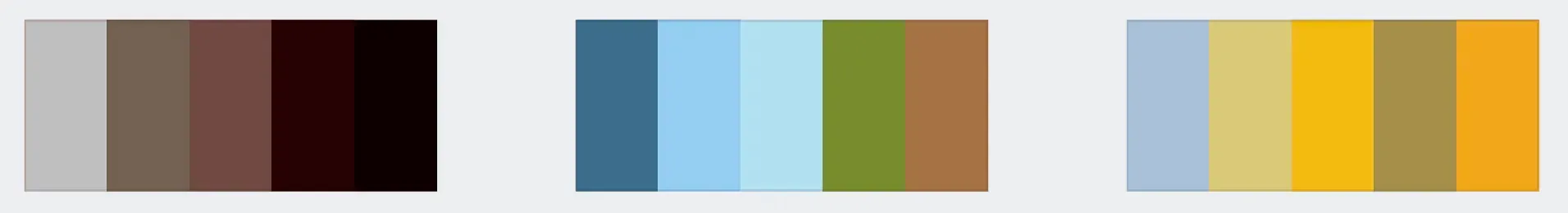
Color schemes for Locations
It is smart to consider the environment you will be photographed in when planning what colors to wear.
At The Beach
At The Park
In The Snow
In The City
Color schemes for Seasons
It is also important to pay attention to the different seasons or times of year. Coordinate complimentary outfit colors when colors change in the environment.
Spring
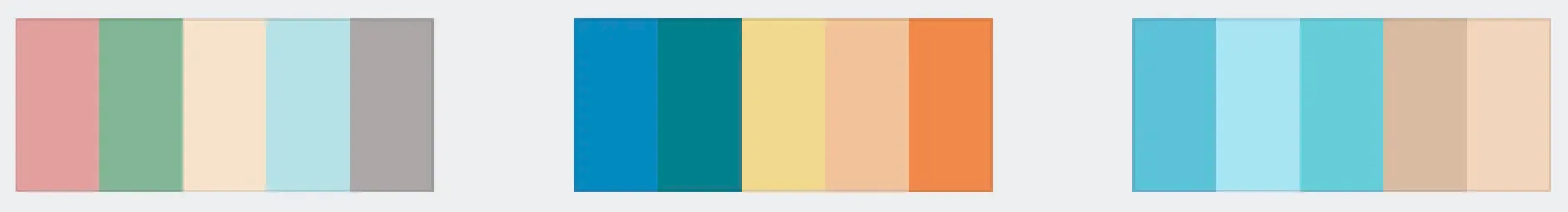
Summer
Fall
Winter

3 Easy Steps To Pick Your Outfit Colors
STEP #1
Consider the location where you will be taking photos. Pick colors that either harmonize or contrast with the environment. Harmonizing your outfits with the environment creates a peaceful and connected feeling while contrasting your outfits depicts more tension and energy.
Outfits Harmonize With Environment
Outfits Contrast Environment
STEP #2
Start with an analogous color scheme. Simply put pick colors that are next to each other on the color wheel, for example, Purples, Grays, and Mauve. This is the easiest color scheme to pick clothes.
STEP #3
Accessorize with pops of bolder colors to add more contrast to the image. I like to add bolder colors that are complementary to your main tones.
Where To Shop For Family Outfits
With a color scheme in mind for your family portraits it's time to put a plan into action to find the perfect outfits. Hopefully, this is the fun part for you, but if shopping isn't your thing I have some suggestions to get the ball rolling.
First, start by looking in your closets. With an idea of what you want to wear see if you already have any tops, bottoms, or dresses. It's ok if you don't. These top clothing stores have got you covered. Here are some stores that will help you get started.
For moms: Bohme, Zara, Gap, Target, Amazon.
Keywords to use in search: maxi dress, tulle skirt, tuckable sweater.
Dads: Zara, Target, Kohl's, Amazon, Old Navy.
Keywords to use in search: Chino pants, dark wash jeans, crew neck sweater, henley top, button-up top
Boys: Zara, Target, Kohl's, Amazon, Old Navy.
Keywords to use in search: Henley, button-up, flannel, khaki pants
Girls: Zara, Old Navy, Rylee + Cru, Target
Keywords to use in search: Pattern dress, tulle skirt, knit sweater, flared pants, woven top
For those last-minute shopping needs, Amazon is always a quick and convenient option. With its vast selection of clothing and fast shipping, you can easily find the perfect outfits for the whole family with just a few clicks.
FAQs
What to wear in family photos to look thinner?
When it comes to family photos, the most important thing is to wear something that makes you feel comfortable and confident. However, there are a few tips that can help you create a more flattering look and accentuate your best features:
Dark, Solid Colors: Dark, solid colors like black, navy blue, and dark green can help create a slimming effect.
Vertical Stripes: Vertical stripes can help elongate your silhouette and make you appear taller and thinner.
Fitted Clothing: Wearing fitted clothing can help create a streamlined look and downplay any areas that you might want to conceal.
Avoid Baggy Clothing: Avoid wearing baggy clothing, as it can make you look larger and add bulk to your silhouette.
Choose the Right Fabric: Choose fabrics that drape nicely and don't cling to your body, such as cotton, silk, or rayon.
Accessorize: Wearing a statement necklace, earrings, or scarf can draw attention to your face and away from your body.
Comfortable Footwear: Wearing comfortable, supportive shoes with a low heel can help elongate your legs and create a flattering look.
Remember, the most important thing is to wear something that makes you feel comfortable and confident. When you feel good, it shows in the photos and can help you create a more flattering look.
What are the best colors to wear for family photos?
The best colors to wear for family photos can be chosen using a color wheel and a color scheme. This helps incorporate a mix of complementary colors and neutral tones.
Consider using a color palette featuring shades that work well together, such as pastels, earth tones, or a mix of light and dark colors. Creating a color scheme can help each family member's outfit to coordinate without matching exactly, allowing for a cohesive and visually appealing look in the photos.
When choosing colors for family outfits for photos, it's important to avoid certain colors that can clash or create a distracting look. For instance, it's best to avoid neon colors, bright patterns, and overly bold or clashing colors that can detract from the overall aesthetic of the photos. Additionally, it's best to steer clear of all wearing the same color or pattern, as this can make the photos appear too matching and less visually interesting.
Should I bring multiple outfits for a photo shoot?
Bringing multiple outfits for a photoshoot can complicate a family session. It is only recommended to bring a backup outfit for young children in case they have an accident.
If you would like to add variety to your photos bring layers instead of multiple outfits. For example adding a scarf, hat, or jacket could change the look of your outfit.
Do colors matter for black and white photographs?
Yes, colors still matter for black-and-white photographs.
Different colors will translate into values of grey. Black and white photos look better when outfits have bolder colors and more contrast.
Wear outfits that will look good in color photos and the black and white images will follow suit.
Should everyone wear the same color for family photos?
No, everyone should not wear the same color for family photos. Instead, when planning the colors for family photos, it's important to consider how they will look when they are all together in a photo. To ensure everyone coordinates without looking too matchy-matchy, try to use a variety of complementary colors and neutrals.
When selecting outfits, consider using a combination of solid colors and subtle patterns to add depth and visual interest without overwhelming the photos. By carefully choosing colors and coordinating outfits, you can achieve a harmonious and stylish look for your family photos.
Pro Tip: For every 2 solid colors add one pattern. But be careful your pattern isn't too busy or loud.
What is the most flattering outfit for pictures?
The most flattering outfit for pictures will vary depending on personal style and body type, but there are some general guidelines that can help. Here are some tips to keep in mind:
Stick to solid colors: Neutral colors such as black, navy, grey, or white are classic and timeless. Loud and bold colors can be distracting in photos.
Choose clothing that fits well: Clothing that is too loose or too tight can be unflattering. Make sure everyone is wearing clothes that fit properly.
Avoid patterns and prints: Busy patterns can be distracting and take away from the faces.
Dress up a little: Even if it's just wearing a collared shirt or a nice dress, this will influence the final outcome of the photos.
Wear layers: Layered clothing can add texture and interest to the photos.
Avoid shorts or short skirts: Shorts and short skirts can be unflattering and cut the legs off in photos.
Consider the neckline: V-necks and scoop necks are more flattering than high necklines in family photos.
Consider the hemline: Knee-length or just above the knee is the most flattering hemline for most people in photos.
Are clothes with logos and graphics okay for family photos?
Logos and graphics should be avoided for family photos. These can be very distracting and take away from individuals.
In addition, a good rule of thumb is to wear solid colors and mix patterns in sparingly.
Is it ok to wear black in family photos?
It is ok to wear black in family photos, but it should be kept to a minimum. Multiple people wearing black will blend into each other.
Wearing too much black loses definition and contrast.
What colors to avoid for photoshoot?
There are a handful of colors to either avoid completely or keep to a minimal use when picking your family photo color schemes. Of course, this is my opinion based on years of photographing families, editing, and printing photos.
Black should be used sparingly or not at all. The same goes for dark blues. These two colors don't allow for the subject to stand out and tend to get lost in photos.
Neon colors are a big NO. It is not flattering, these colors are distracting and will draw attention away from the face. They also don't photograph well.
Bright red should be used sparingly, not as a main color. If you must incorporate red use it as an accessory or a small detail.
White might seem harmless and neutral, but it reflects light on your face and doesn't photograph well. If multiple people are wearing white they might capture light differently. Opt for an off-white or light beige color instead.
Bright bold colors in general should be used sparingly or as accent pieces.

Meet Christopher Todd: Your Orange County Photographer
Hi, I’m Christopher Todd! I launched
Christopher Todd Studios back in 2000, but my love for photography started long before that.
Born and raised in Orange County, I’ve spent my life exploring this beautiful area. From surfing in Huntington Beach to discovering the best photo spots across the OC. Over the past
25 years as a professional photographer, I’ve continued to learn, grow, and refine my craft.